The Maine Coon × The Watercolor portrait
Where the line takes over from the wash
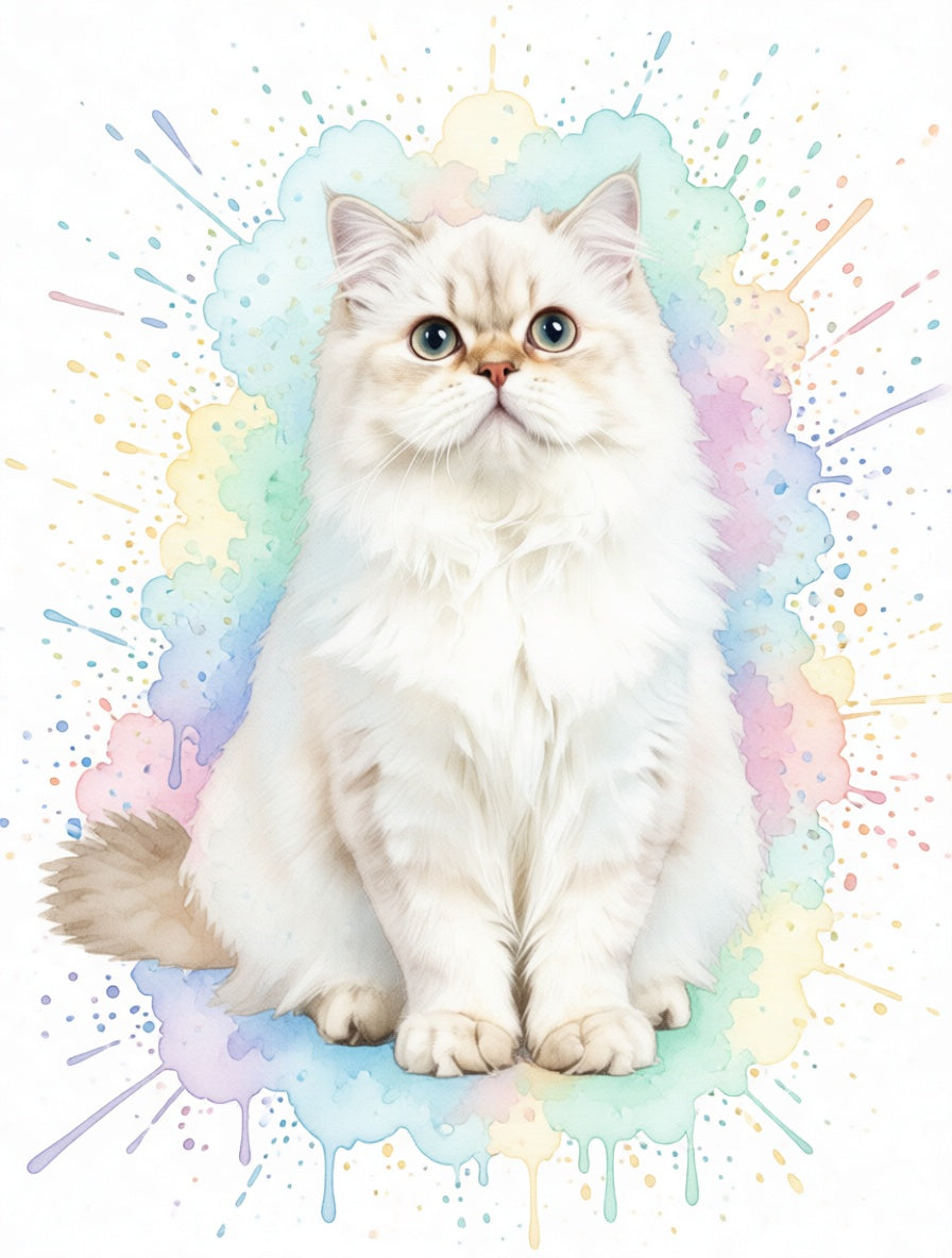
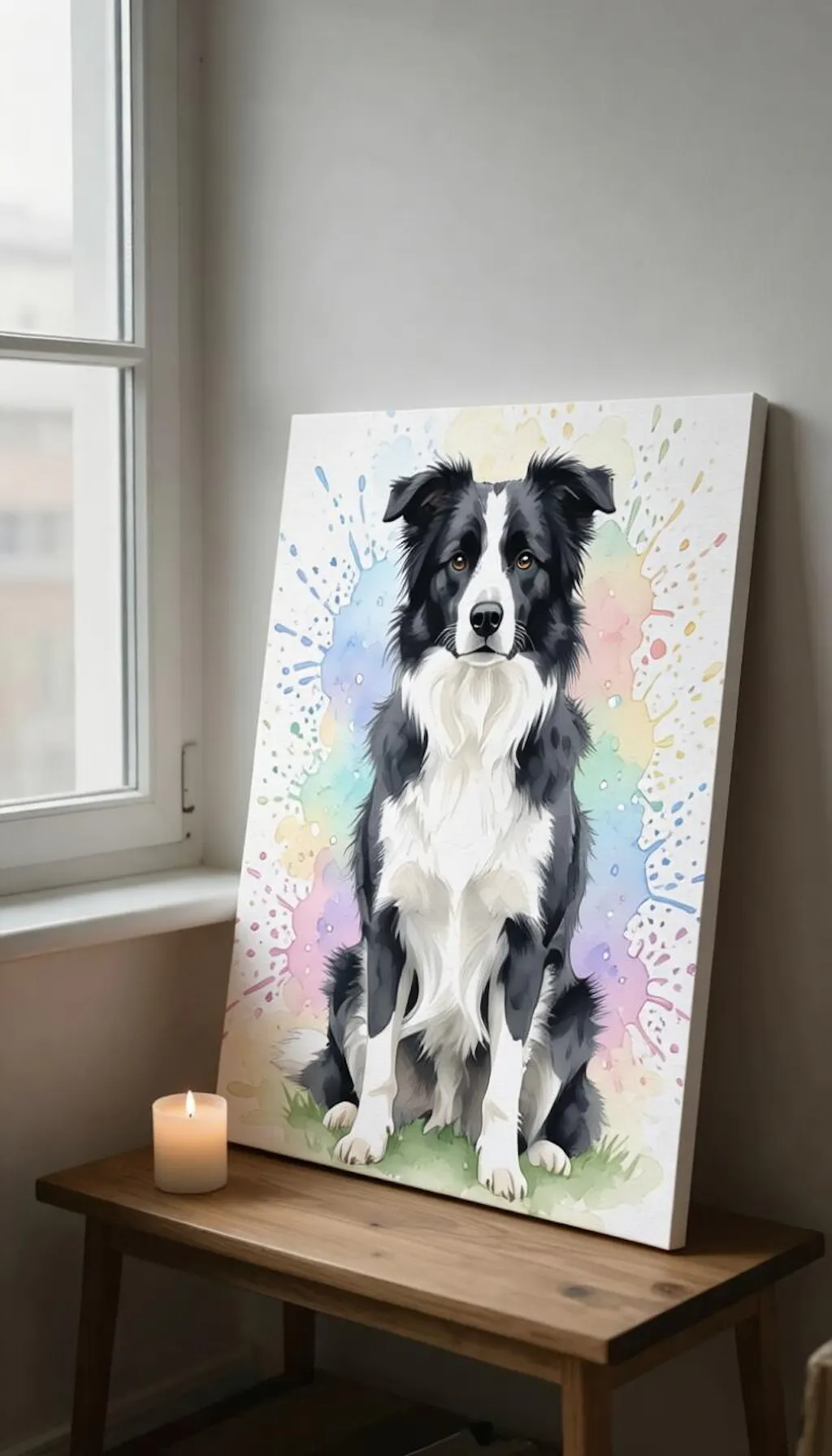
Watercolor runs on contrast: fluid pastel wash for atmosphere, clean ink-like line for definition. The wash handles the long body fur and the airy background; the line handles the breed-defining features — lynx tips, ear-tuft outline, ruff edge, whisker base, eye markings. Your Maine Coon stays unmistakably itself inside the dreaminess. Nothing important to the breed gets lost in the wash.
Pastel palette for any Coon coat
The palette stays soft regardless of coat color but adjusts its center of mass. A brown tabby gets warmer pastel washes — peach, soft amber, blush. A silver or blue gets cooler tones — pale lilac, mint, dove gray. Torties get the most varied watercolor field, with multiple wash colors echoing the broken coat. The composition stays delicate even when the cat in front is substantial.
Best as matte poster, not canvas
Watercolor wants a smooth paper-finish surface so the pastel wash reads as continuous color. Canvas weave is too pronounced a texture — it muddies the soft tones and competes with the fluid line. Matte Poster or Wooden Framed Poster in light or natural wood is the technically correct choice. Save framed canvas for the oil and impasto portraits; for watercolor, paper finishes are right.