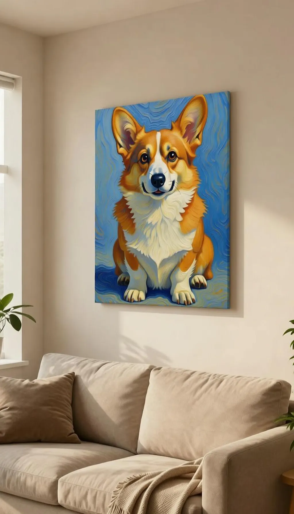
Oil painting style on canvas for my corgi. Looks like something from a museum. The texture really adds to it.
The portrait matches the online preview exactly. Delivery was faster than expected. Five stars.
P
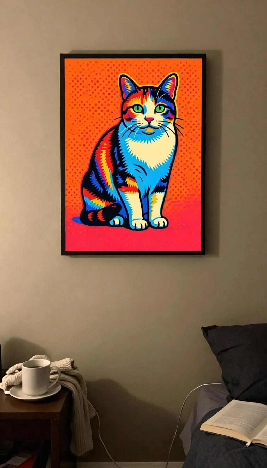
Wooden Framed Poster Got the pop art style for a friend. She absolutely loves it. Will order one for myself soon.
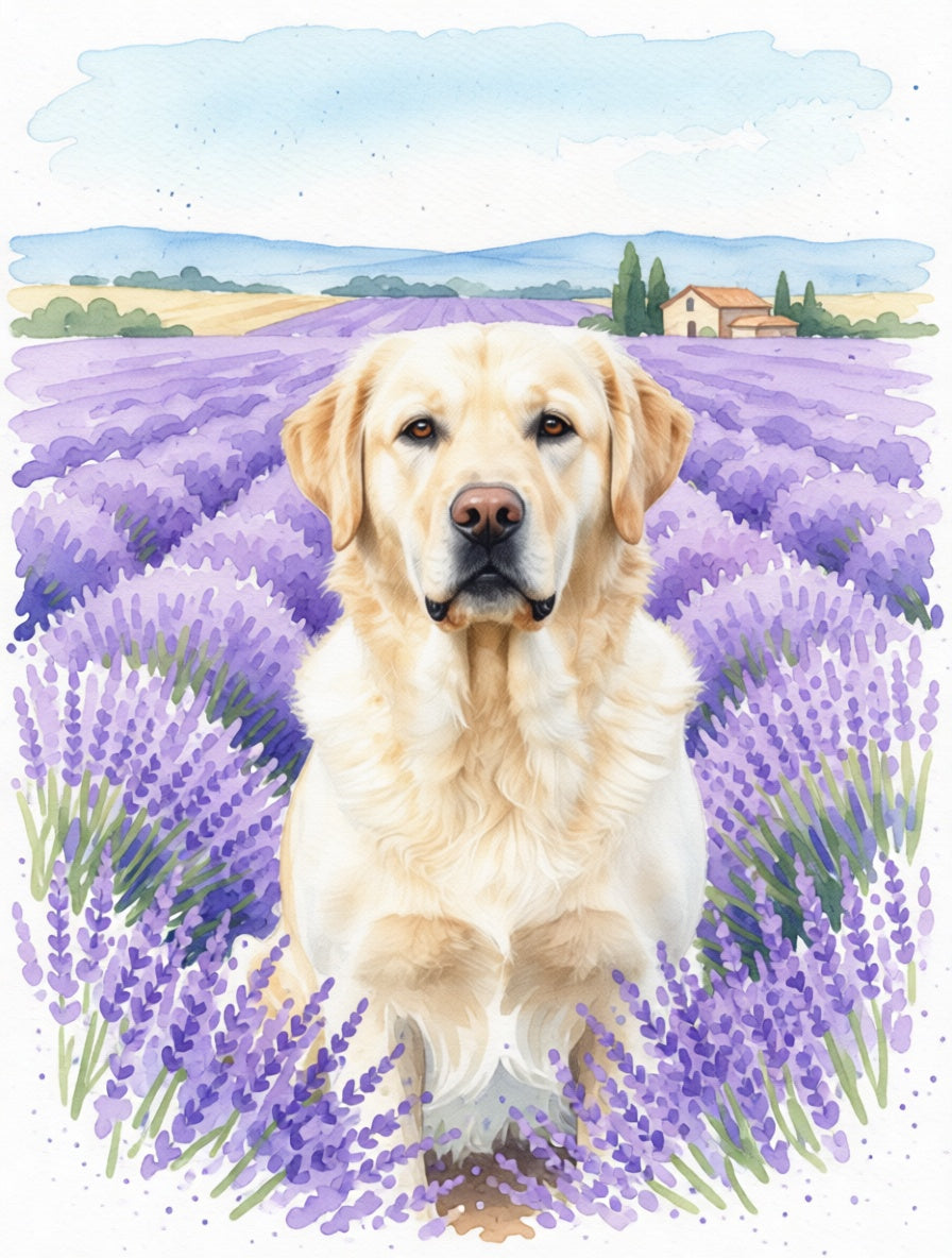
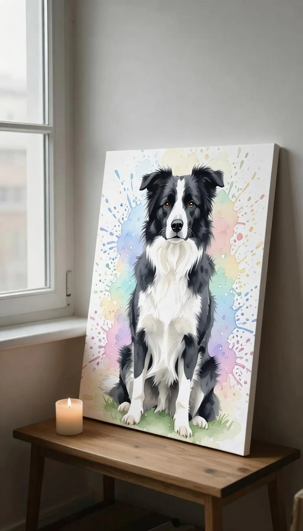
We lost our dog last year and this canvas portrait is the perfect tribute. Watercolor style looks stunning.
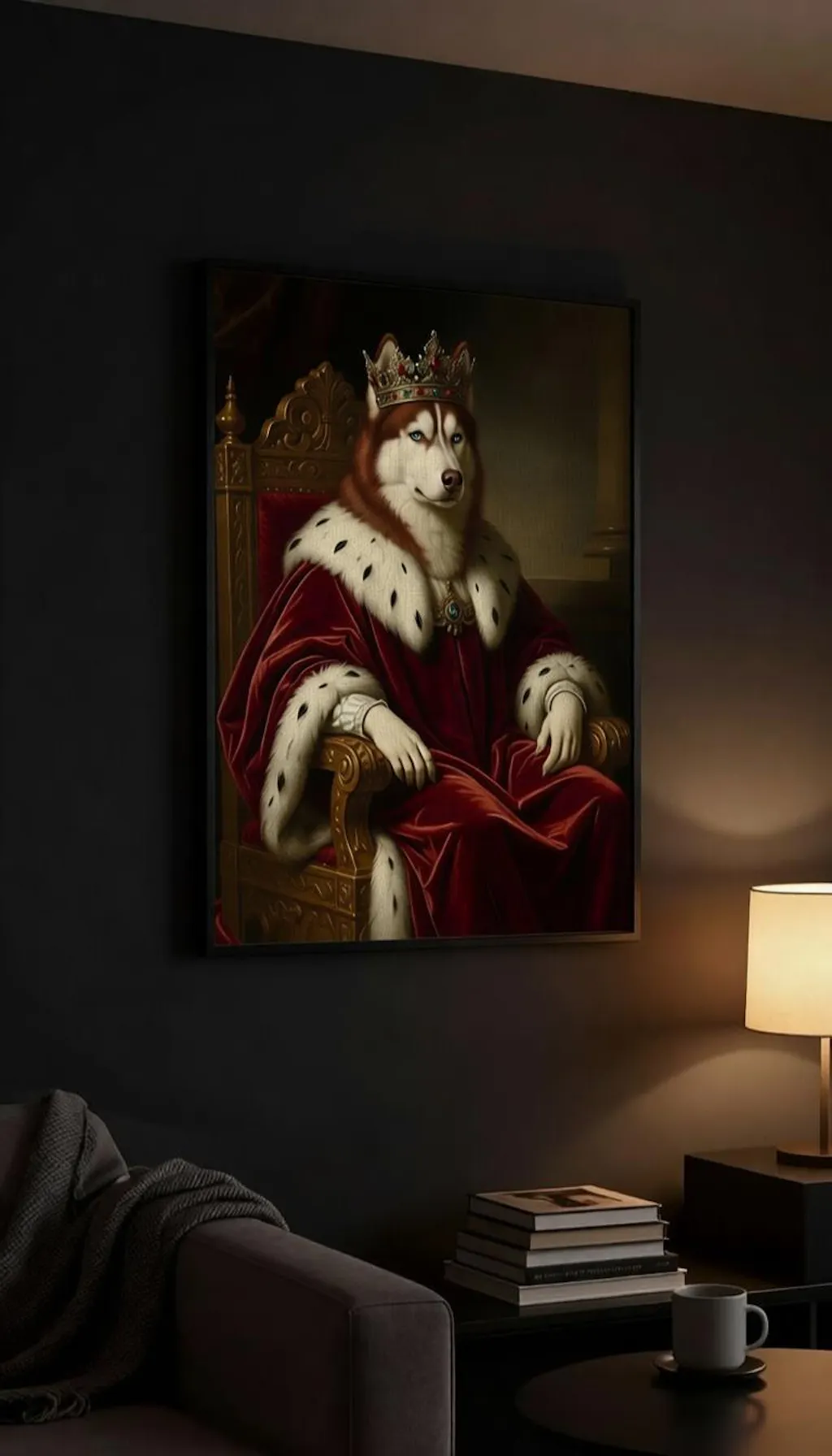
I was skeptical about AI portraits but this completely exceeded my expectations. My husky looks like actual royalty.