Persian as In Lavender Field

For Persian owners

Provence lavender against a Persian's silken ruff

A field of lavender is essentially the same texture as a Persian ruff — both want to be touched. This portrait paints them as one continuous soft material.

Upload your photo →

Free instant preview · From $19.99

  • Lavender
  • Provence
  • Dreamy
  • Colorful

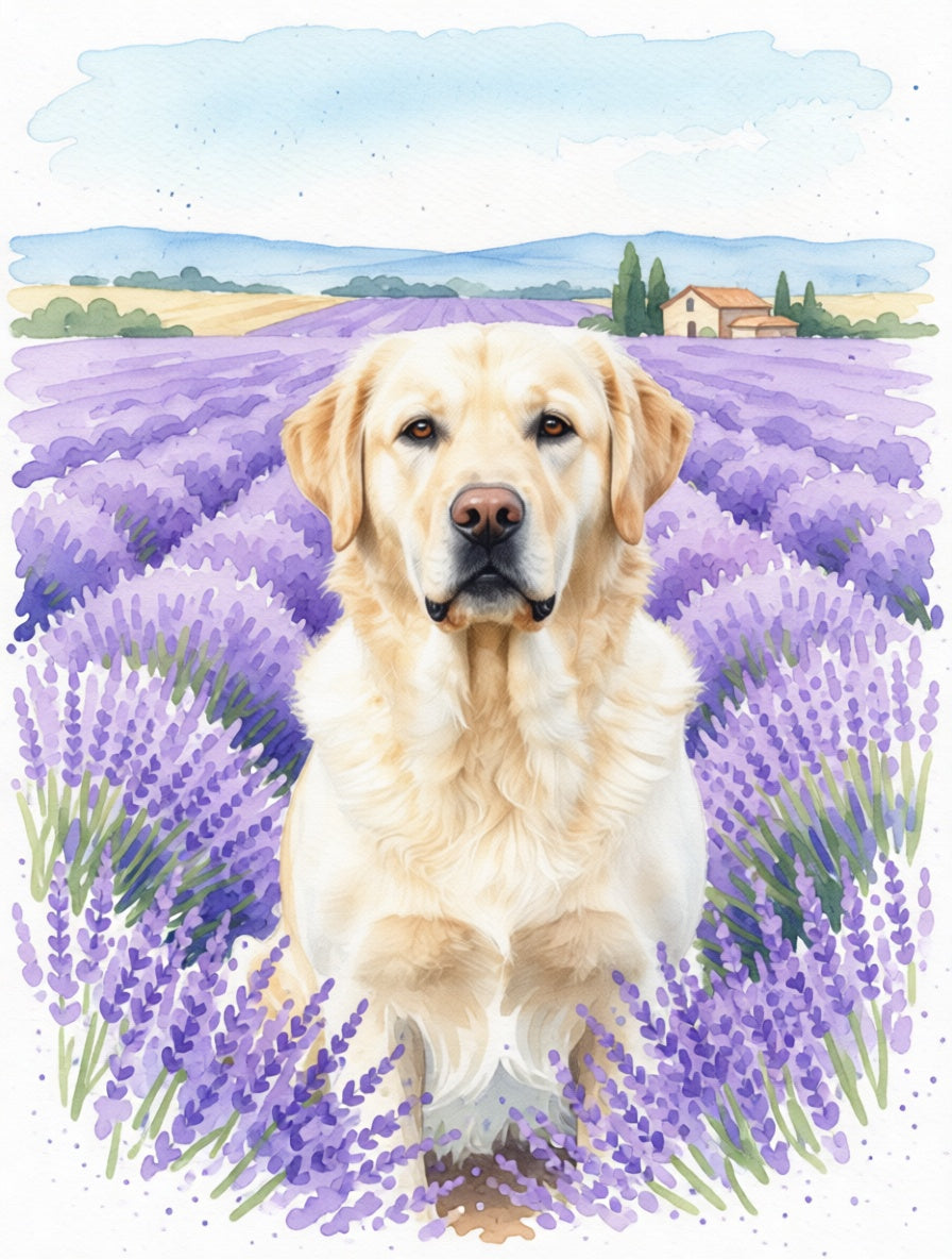
The Persian × In Lavender Field portrait

Two soft textures in one painting

Lavender at distance and Persian fur up close share the same visual logic — soft repeating shapes, gradual color, no hard edges. The watercolor wash lets them blend at the boundary so your cat looks grown out of the field rather than landed on it. The dense outer coat picks up a hint of purple in its shadows, and the cooler lavender in the distance pulls the eye back from the warm face.

Purple flatters every coat color

Purple is the most universally flattering background for a Persian. White and cream coats sit cleanly against it; black and smoke coats deepen rather than disappear; red and golden coats get a clean complementary contrast. We tune the warmth of the surrounding lavender slightly toward or away from your specific coat to keep the cat as the brightest, most legible point in the painting.

Best as framed poster

Wooden Framed Poster in pale wood is the natural pairing — matte archival paper holds the lavender's quiet purples without dulling them, and the soft frame keeps the Provence mood. A Canvas print is the option if you want a more painterly, hand-touched surface; both work for this softer style.

Common questions

About this portrait

Will a Persian's long coat blur into the lavender or hold its shape?
It does both, intentionally. The outer ruff and the tail blur softly into the lavender wash at the edges, so the cat reads as part of the field rather than collaged on top. The face, ears, and the front of the chest stay sharply defined in watercolor line, which is what keeps the portrait reading as a portrait rather than a mood piece.
Does the soft purple palette wash out a copper-eyed Persian?
No — quite the opposite. Copper eyes against soft purple is one of the cleanest complementary contrasts in color theory, and we keep the eye color precise so it pops as the warmest point in an otherwise cool composition. Blue eyes harmonize with the lavender for a softer, dreamier effect; odd-eyed Persians get both at once.
Is this combo flattering to a heavier, cobby-built Persian?
Yes — the upright portrait pose hides nothing about Persian body shape, but the lavender field's soft horizon and the watercolor's gentle palette make the cobby build read as composed and stately rather than flat or stocky. Heavier Persians actually anchor the composition particularly well; the eye lands on them first.

See your Persian in other styles

  • The Abstract

    From $19.99

    Preview →
  • The Admiral

    Preview →
  • The Art Nouveau

    Preview →
  • In the Autumn Forest

    Preview →