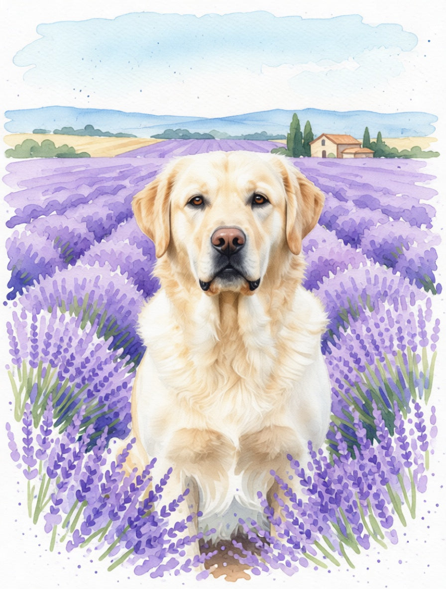
The Maine Coon × In Lavender Field portrait
Complementary colors doing the work
Purple and amber sit opposite on the color wheel, and the classic Maine Coon palette — brown tabby, red, cream, gold-eyed — is amber-leaning. Against the lavender field the coat warms by contrast: burnt-umber stripes glow, copper eyes deepen, cream undercoat brightens. Silvers and torties shift cooler, and both still hold because the watercolor wash is forgiving.
How the watercolor handles long fur
The medium is built on the contrast between fluid pastel wash and clean line. The lavender field stays as wash; the ruff line, ear tufts, and eye markings stay as line. Long fur reads as suggestion at the body and as deliberate detail at the silhouette edges. Your specific Coon stays your specific Coon — the wash dreaminess never erases the breed features.
Best on matte poster, not canvas
Watercolor wants a smooth matte print surface so the wash reads as continuous color. Canvas weave is too heavy a texture for the medium and tends to muddy the violets. Matte Poster or Wooden Framed Poster in light or natural wood holds the lavender field cleanly. Save framed canvas for the oil portraits — for watercolor, paper-finish prints are the technically correct choice.