The Pug × The Impressionist portrait
Why impasto and wrinkles fit
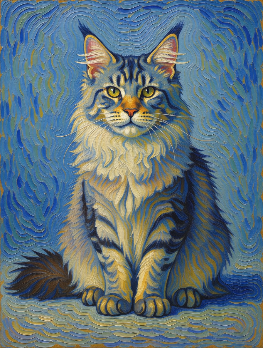
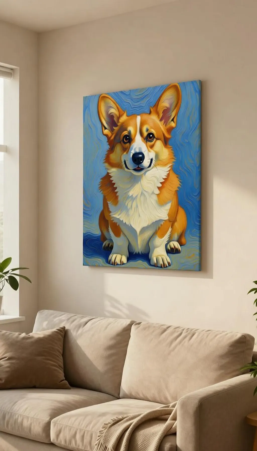
Thick oil paint builds up in ridges. So does a Pug's brow. We let the two textures echo each other — brushstrokes follow the actual lines of the face, fold into the muzzle creases, and pool around the eyes. The result is a portrait that looks built rather than printed, with the wrinkles reading as deliberate Van Gogh-style mark-making.
Coat colour as palette anchor
Fawn Pugs get a warm impasto palette — golds, ochres, soft pinks against an umber background. Black Pugs get deeper blues and indigos working through the coat with violet highlights. Apricot lands gently between. We set the palette by the dominant coat colour so the brushwork has a coherent set of pigments to work with rather than a generic dog template.
Best on real-feel canvas
This is the style that most demands a textured surface. Framed canvas reads correctly — the woven matte adds a physical layer of texture that makes the printed brushwork look almost three-dimensional. Glossy paper flattens the impasto and loses half the effect. If you only buy this one combo as canvas, you'll feel the difference; if you buy it as poster, you won't.